Are you in the business of staying ahead of the curve, predicting market trends before they become mainstream? If so, you’re in the right place. We’re introducing you to an innovative tool within the Trendata market intelligence platform that’s designed to keep you ahead of the pack — the Product Benchmarking insights liveboards. These liveboards are not your average analytics tool. They offer a comprehensive 360-degree view of your product series, tracking everything from their popularity and growth to their share of search and associations. But the insights don’t stop there. The liveboards also highlight trending products, giving you a clear picture of what’s catching consumers’ attention right now. So, if you’re ready to transform the way you understand and respond to market trends, dive in with us as we explore the power of Trendata’s Product Benchmarking insights.
Product Series Overview
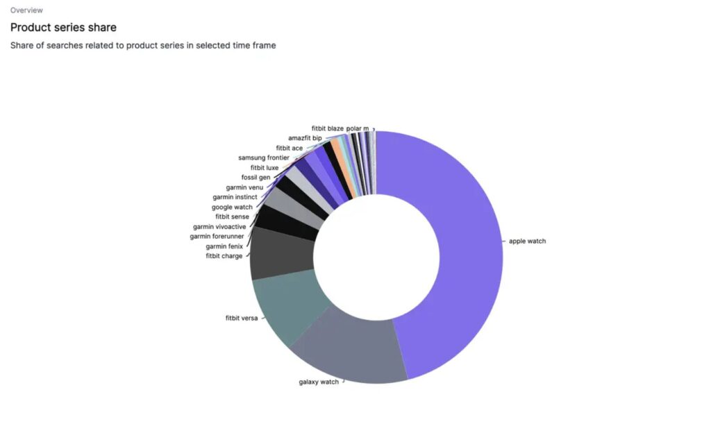
When it comes to staying on top of the latest consumer trends, the Product series overview liveboard is an indispensable tool in your arsenal. It’s your quick snapshot of what product series people are gravitating towards, keeping you one step ahead in the marketplace. With a doughnut graph as the centrepiece, you’ll be able to visualize at a glance which product series are capturing the hearts and minds of consumers. But it’s not just about pretty pictures — the interactive hover feature allows you to drill down and see the exact share of search for each product series.
If you want to track changes over time and identify emerging trends, just look to the line graph on the right. With this, you can watch the evolution of consumer interest in different product series.
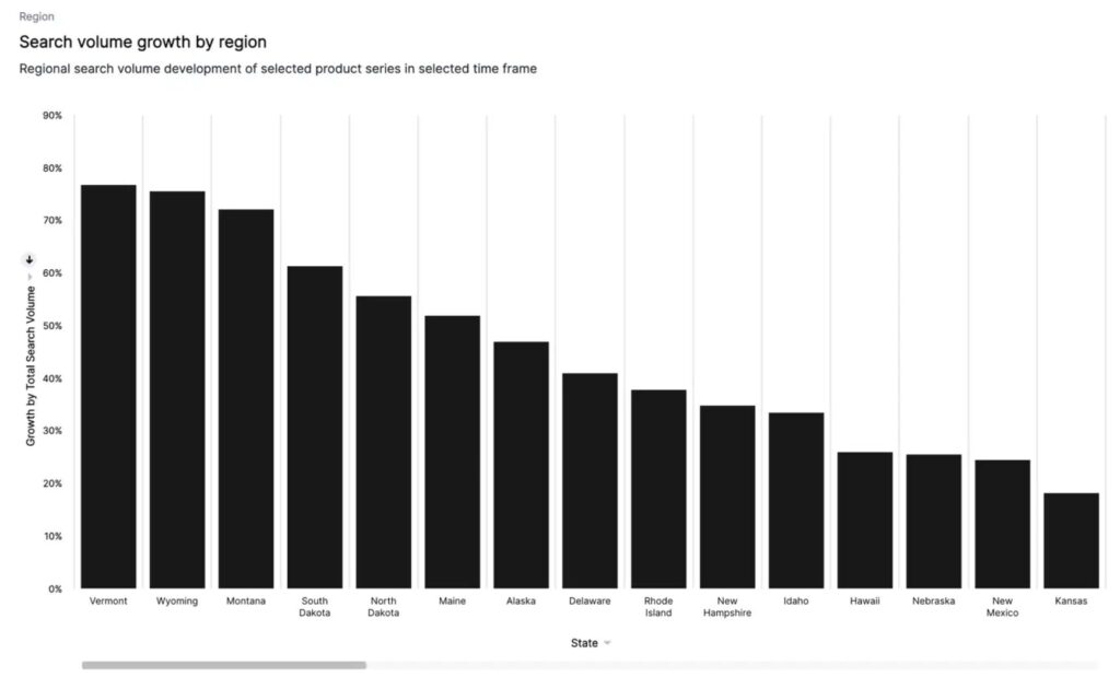
The Region tab takes your analysis to a new level, providing a geographic breakdown of search shares. This empowers you to customize your strategies to meet local demand, identifying which regions are fueling the popularity of certain product series, and pinpointing where your products are making the most significant impact.
Product Series Popularity
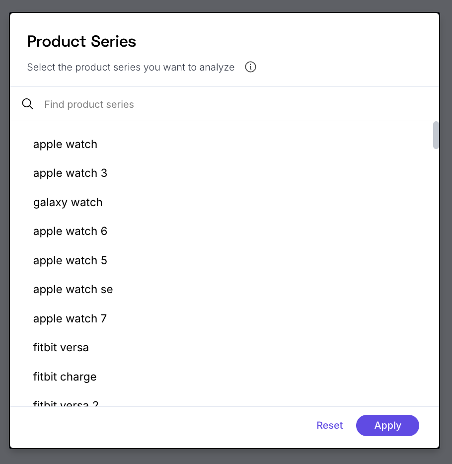
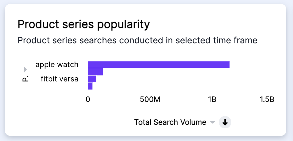
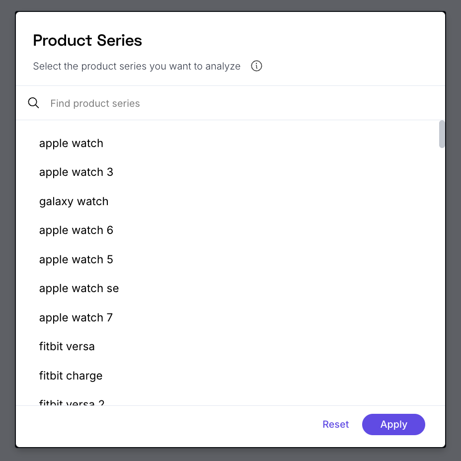
The Product series popularity liveboard is your gateway to in-depth analysis of specific product series, providing a wealth of data to enhance your understanding of market dynamics. When you enter the liveboard, a pop-up invites you to select one or more product series for analysis. If you’re unsure, don’t worry — the default setting offers a comprehensive overview of all series. But if you’re keen to pit your product series against competitors’, go ahead and select those that pique your interest.
On the left of the liveboard, a horizontal graph presents the exact search volume for your chosen product series within the selected timeframe. This gives you a quantifiable measure of their popularity. You can use these insights to spotlight your star performers in marketing campaigns or give your underdogs a little extra love.
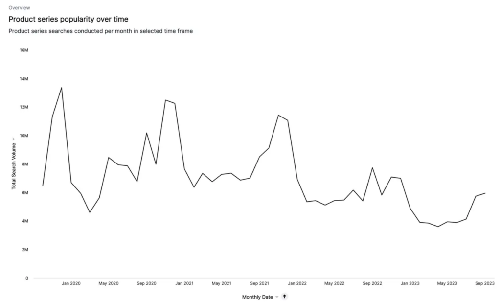
To the right, a trendline graph illustrates how this search volume has evolved over time. By hovering your mouse over the trendline, you can see specific search volumes at different points, revealing patterns and trends in consumer interest.
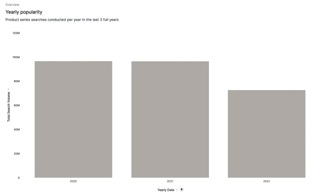
For a broader perspective, the Yearly Popularity Graph, located at the bottom left, offers a stacked bar graph displaying the exact search volumes for your selected product series across three consecutive years. This is particularly useful for identifying any seasonal fluctuations that could inform the timing of your marketing campaigns.
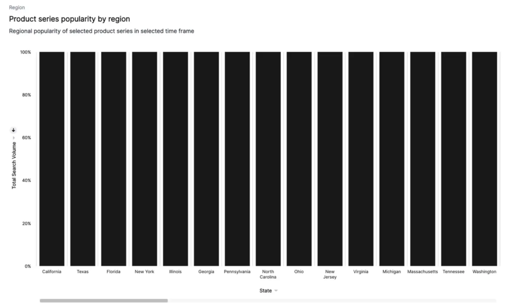
Lastly, the Region tab provides a geographic breakdown of search volumes, showing the popularity of each product series per region within your selected timeframe. Think of it like a map of consumer preferences. Discover whether certain product series are winning hearts in specific regions. This knowledge can help you tailor your marketing efforts, focusing resources where they’re likely to make the most splash.
Product Series Growth
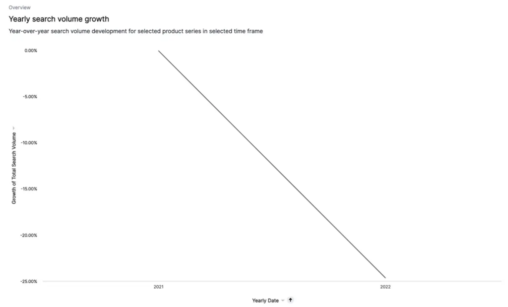
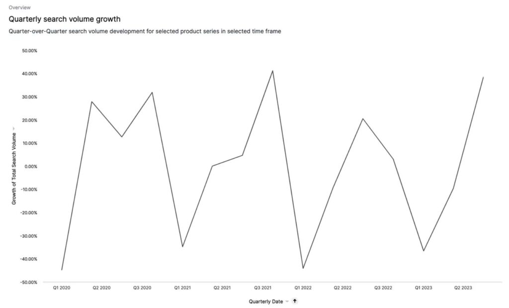
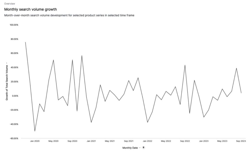
While knowing the exact search volume of a product series is valuable, understanding its growth trajectory can offer even more strategic insights. The Product Series Growth liveboard offers an insightful lens into the evolving landscape of product series, providing crucial data to inform your assortment and marketing decisions. This liveboard presents the growth of each product series from three different perspectives: year-over-year, quarter-over-quarter, and month-over-month. Each perspective offers a unique viewpoint, allowing you to understand the journey of your product series over time. It’s like having a time-lapse camera on your market, revealing both slow-burn trends and sudden shifts.
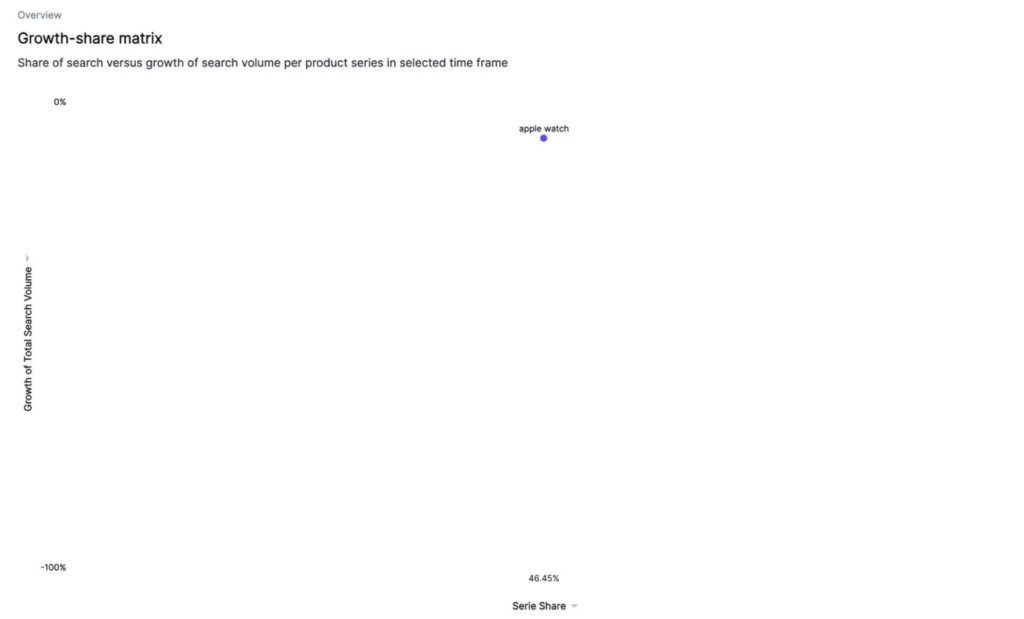
The Growth-Share Matrix, a key feature on the board, plots the position of each series based on its share of search against the growth of its search volume from the first to the last month. The further right and higher a series is on the matrix, the more significant its role (or potential) in the market. Think of it as a compass guiding you to your next big winner.
And for a geographical perspective, look to the Region tab allows you to view the growth of your product series by region within your selected time period. It paints a picture of your product series growth by region within your selected timeframe. This insight can help you tailor your marketing efforts, focusing resources where they’re likely to make the most impact.
Monitoring competitor dynamics is also crucial. If a competitor’s product series has experienced rapid growth, it’s one to watch closely. Conversely, if your own product series is showing a decline, you’ll need to evaluate whether to shift focus to a different series or redouble marketing efforts on the declining one. To aid this decision-making process, refer to the trendline in the Product Series Popularity Liveboard. It can indicate whether the decline is a recent development or part of a longer-term trend.
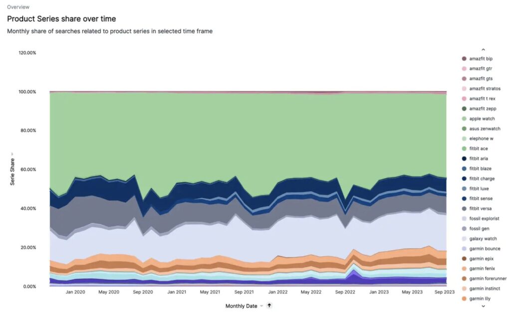
Product Series Share
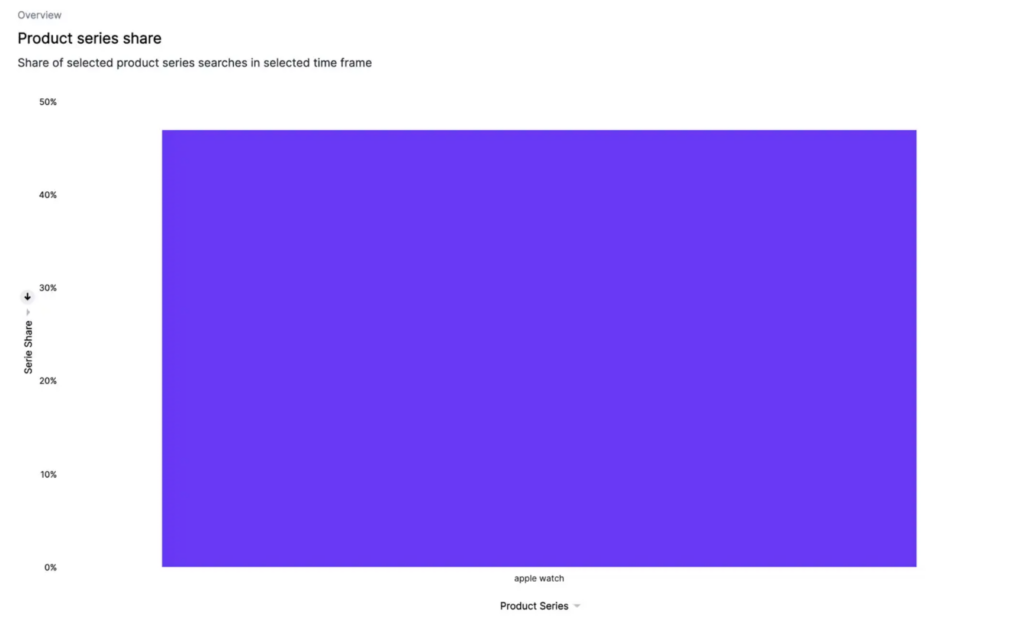
The Product Series Share liveboard provides insights into the share of search for your selected product series, offering another layer of understanding beyond mere search volumes and product development. On the left side of the liveboard, a bar graph displays the exact shares of search for each product series within your chosen timeframe. This allows you to get a clear picture of the relative popularity of different series in the market, helping you identify your top performers and those that might need a little extra boost.
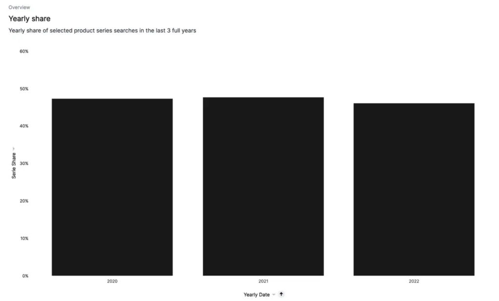
Below this, a stacked bar graph presents the share of search for each product series over three full consecutive years. This long-term perspective is invaluable for spotting emerging trends, cyclic patterns, or shifts in consumer interest. It’s like having your finger on the pulse of the market, keeping you ahead of the curve.
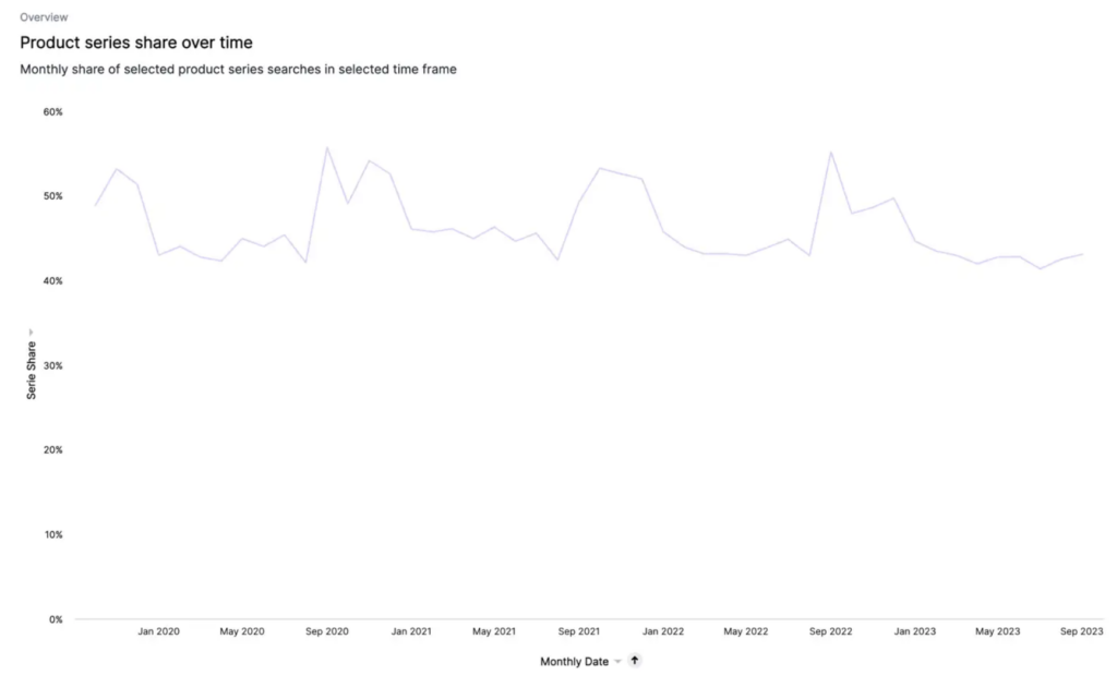
To the right of the liveboard, a trendline graph brings the evolution of these shares of search to life. It gives you a quick visual summary of whether your product series are growing, declining, or maintaining a stable presence in the market. This can help you identify any product series that warrant closer attention.
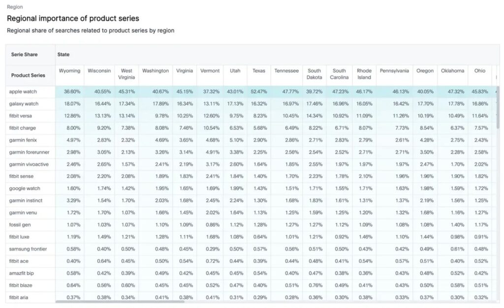
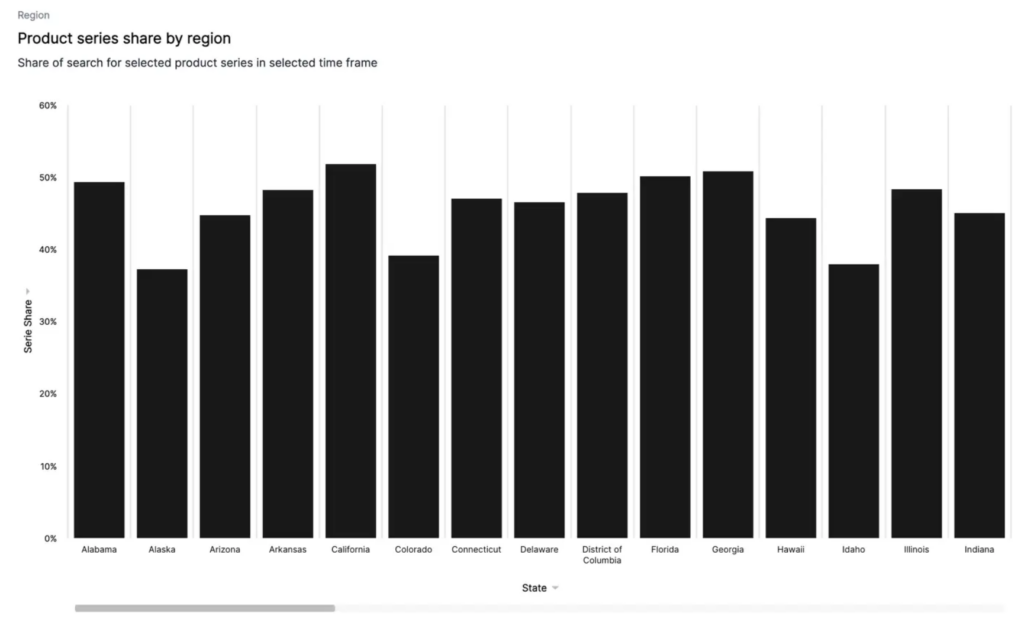
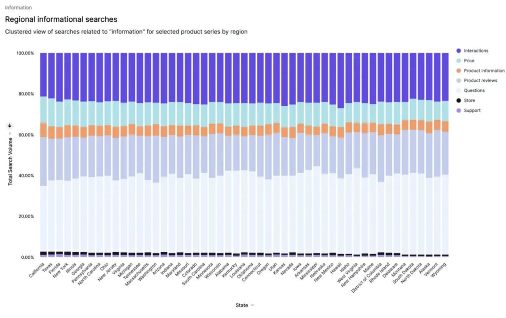
Like in the other liveboards, the Region tab provides a breakdown of the share of search for each product series by region. This can shed light on regional variations in product popularity and inform targeted marketing strategies.
Product Series Consideration
Building on this comparative data, the Product Series Consideration liveboard is a powerful tool that provides deep insights into how consumers interact with your product series. Upon launching the liveboard, a pop-up emerges where you can select a single product series for analysis.
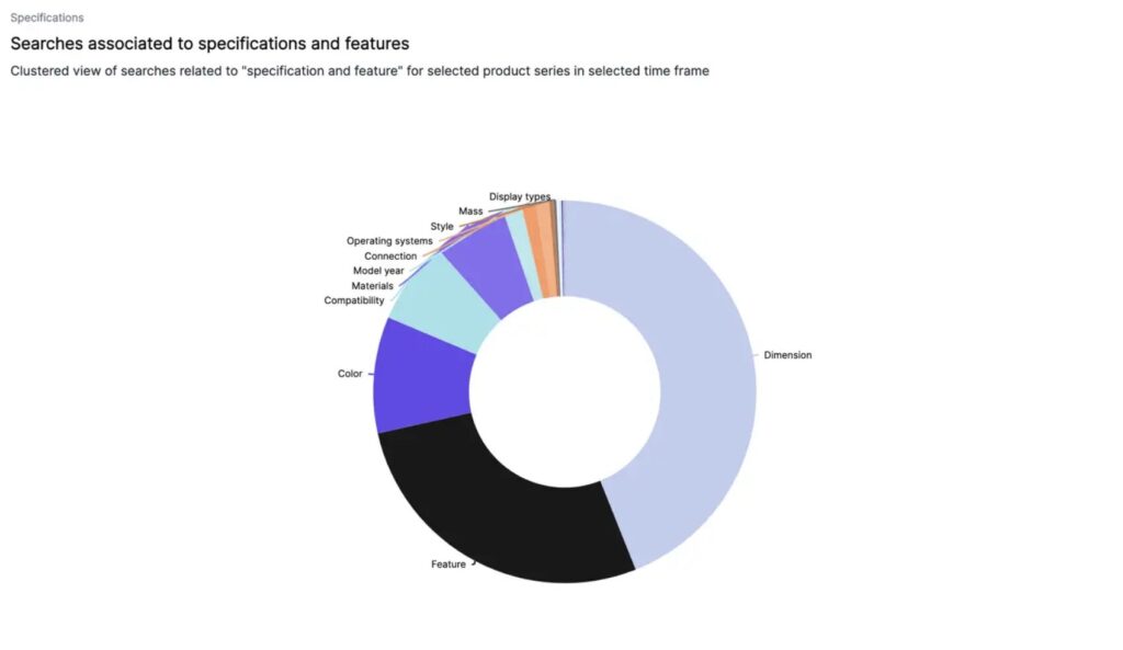
One of the key features is the association data, revealing the search terms people use in conjunction with your product series, which provides valuable insight into consumer behaviour and preferences. Each topic, except ‘Issues’, follows the same layout: on the left, a doughnut graph displays sub-topics within the main topic. Hovering over the blocks within the doughnut graph reveals the exact search volume for each sub-topic within your selected timeframe. The Drilldown function lets you delve into specifics, while the Filter option allows you to focus on a particular sub-topic.
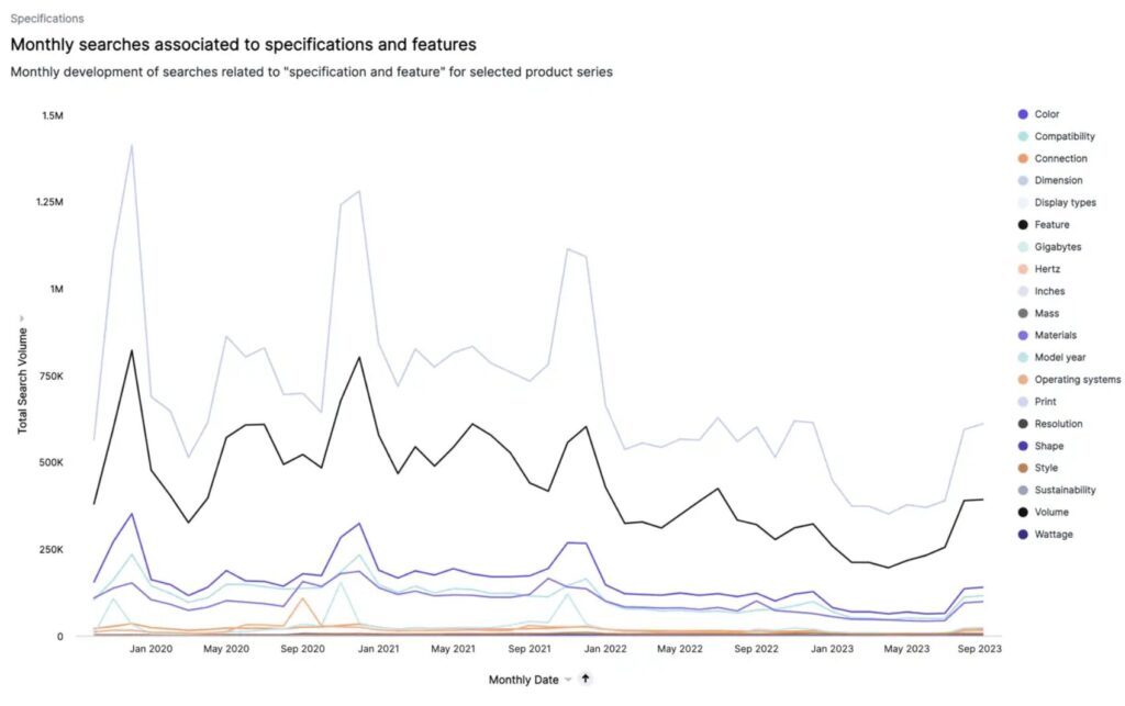
On the right side, a trendline illustrates how each sub-topic has developed over your chosen period. Additionally, a stacked bar graph at the bottom of the liveboard reveals regional search volumes for each sub-topic, providing geographical context.
Let’s explore the five tabs in the Product Series Consideration liveboard on the example of Fitbit Charge.
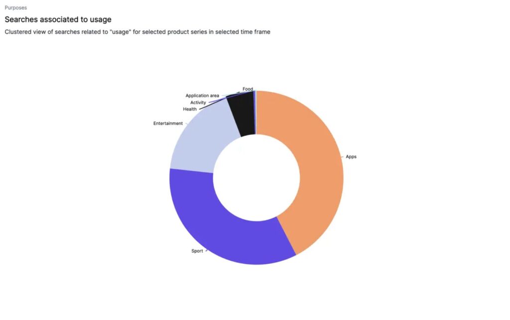
Purposes
The ‘Purposes’ tab reveals the intended uses for your product series, such as different applications or periods. For instance, the Fitbit Charge isn’t just a fitness tracker — it’s used for monitoring food intake, as a health monitor, and even as a music player when connected to apps like Spotify. By understanding these uses, you can refine your marketing strategies, develop content that resonates with your users’ needs, and even consider these purposes during product development for future iterations.
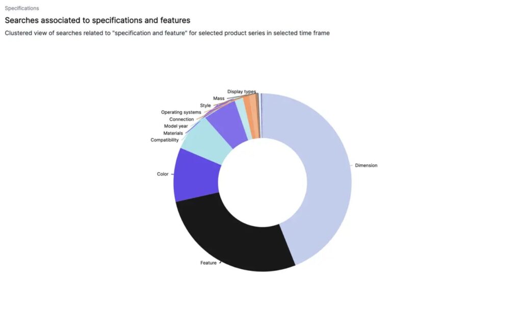
Specifications
The ‘Specifications’ tab displays the specific features people seek in your series, like colours, materials, or sizes. The Fitbit Charge, for example, reveals demand for sleep tracking, waterproofing, different band colours, and phone compatibility. These insights can guide your product development towards incorporating the most sought-after features. It can also steer your marketing efforts to highlight these specifications, ensuring your communications resonate with what potential customers are actively looking for.
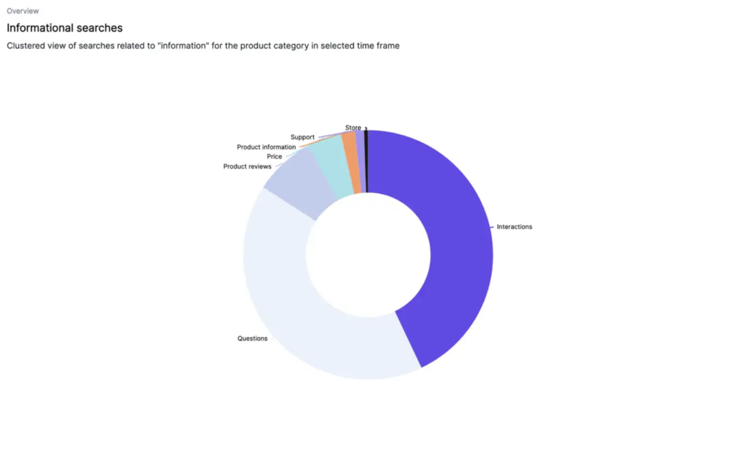
Information
The ‘Information’ section uncovers the type of product information users seek about your series. From price details, syncing instructions, and how to find a lost Fitbit, to product reviews, these insights help you understand where your customers might need more support or information. This could lead to creating detailed FAQs, producing user-guides, or even developing tutorial videos to enhance customer experience and satisfaction.
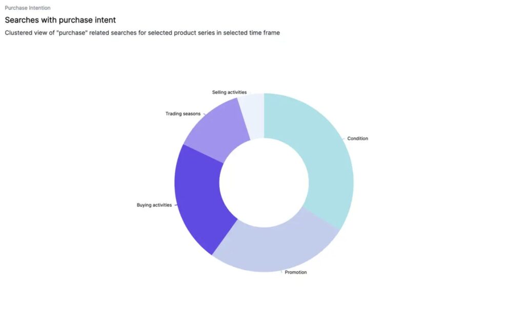
Purchase Intention
The ‘Purchase Intention’ tab reveals the volume of search terms related to price, promotions, condition (like new vs old), and different trading seasons associated with your product series. For the Fitbit Charge, it reveals a demand for refurbished models and increased searches during Black Friday. Such insights could guide your sales and marketing strategy, leading to timely promotions or highlighting competitive pricing. It could also inform your logistics and supply chain, ensuring you have sufficient stock during peak trading seasons.
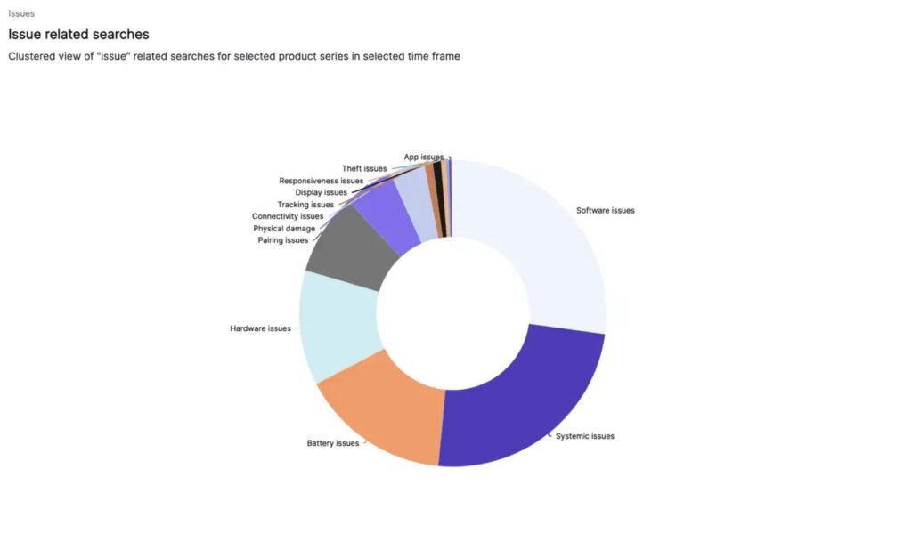
Issues
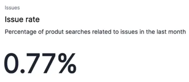
The ‘Issues’ tab is unique — it presents the issue rate or the percentage of the total search volume related to problems with your series.
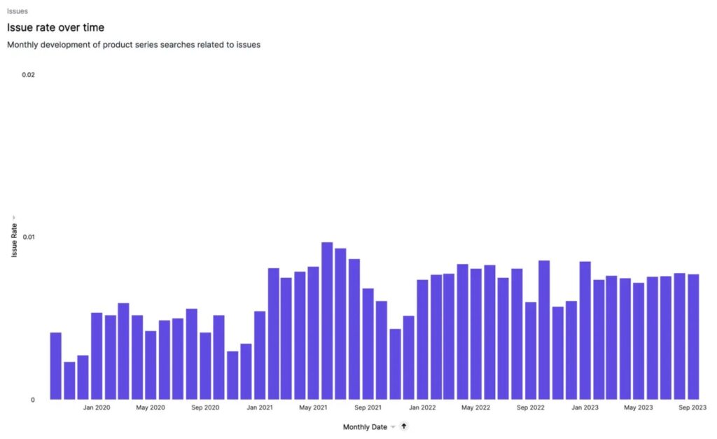
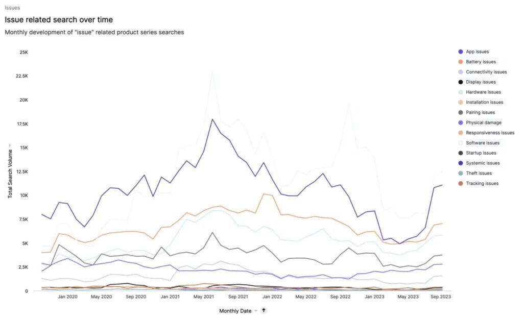
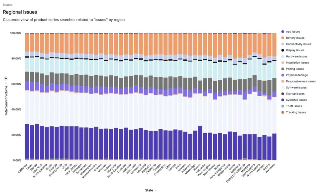
It shows how this rate fluctuates and displays the total search volume of these issues over time. A doughnut graph pinpoints the specific issues users search for in relation to your product series, and a bar graph at the bottom reveals any regional variations.
For the Fitbit Charge, these might include battery life, connectivity, and syncing issues. This tab is an essential tool for your product development and customer service teams. It helps identify common problems, prioritize fixes, and improve overall product quality. It can also guide your customer service efforts, preparing them for common queries and issues, and even proactively addressing these in your communications with customers. In some cases, a tab might display “No data found for this query.” This simply means there are no search terms associated with that sub-topic for your product series. Understanding these associations can provide valuable insights to optimize your assortment or marketing strategies, ensuring you stay ahead of the curve in a competitive marketplace.
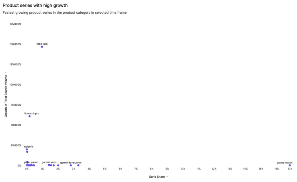
Trending Product Series
The final liveboard of the Product Benchmarking insights focuses on Trending Product Series. This segment identifies which product series are gaining traction by comparing the search volume in the last month to the first month within your selected timeframe. What sets this liveboard apart is its ability to spotlight those product series that have grown from zero volume in the first month to more than zero in subsequent months. It’s like having a radar for potential hits, scanning the horizon for product series that are starting to gain traction. These trending series are then plotted on a Growth-Share Matrix, providing a visual representation of each series’ share of search versus its growth in total search volume. This matrix serves as a valuable tool for identifying which product series are emerging as significant players and warrant your attention.
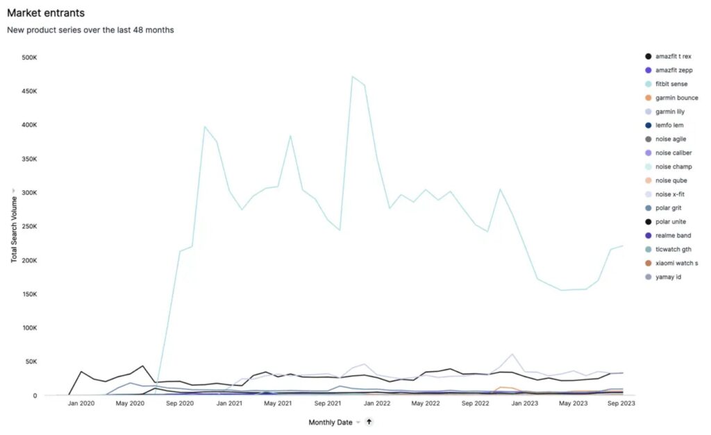
And with the Market Entrants graph, you’ll see new product series that have made their mark in the market over the last 48 months. With this feature, you’ll be privy to the latest trends and innovations, giving you the chance to adapt, innovate, and even lead.
In short, the Trending Product Series liveboard equips you with the tools to spot rising stars in your product lineup and monitor the ever-changing market landscape. It’s not just about keeping up with the trends; it’s about anticipating them.
Benchmark Your Way to Product Success
The Product Benchmarking insights liveboards provide a wealth of insights that can guide and refine your overall business planning. Whether it’s deciding on the launch of a new product, identifying the right time for promotions, or planning resource allocation, these insights can be instrumental. By providing in-depth insights, these liveboards empower you to refine your product offerings and marketing strategies, aligning them with what the market truly wants. You can identify sought-after features, understand usage patterns, and even uncover common issues that need addressing. With these liveboards, you’re not just reacting to the market; you’re staying one step ahead. And you’re not just meeting consumer needs; you’re anticipating them, and setting yourself on a path to exceed them. This proactive approach could be your key to gaining a significant competitive edge.
We use cookies to ensure that we give you the best experience on our website. If you continue to use this site we will assume that you are happy with it.I understand