Understanding your market is not just critical—it’s non-negotiable. From gauging the overall market size to tracking its development and dissecting market shares, every piece of information carries the potential to be a game-changer.
However, navigating through this sea of data can often feel overwhelming. That’s where Trendata steps in.
Our Market Overview liveboards — Market Size, Market Development, and Market Shares — are power-packed with data-driven insights that offer a comprehensive view of your product category.
We’ll take you on a deep dive into these liveboards, exploring how each one can play a pivotal role in your strategic decision-making process.
Market Size Insights
Imagine having a crystal ball that allows you to peer into the future of your product category. Wouldn’t it be great to know exactly when and where your customers are going to demand your products? With Trendata’s Market Size liveboard, you have just that.
The Market Size liveboard is your gateway to understanding the dynamics of your product category. It’s not just about numbers; it’s about decoding patterns, predicting trends, and capitalizing on opportunities.
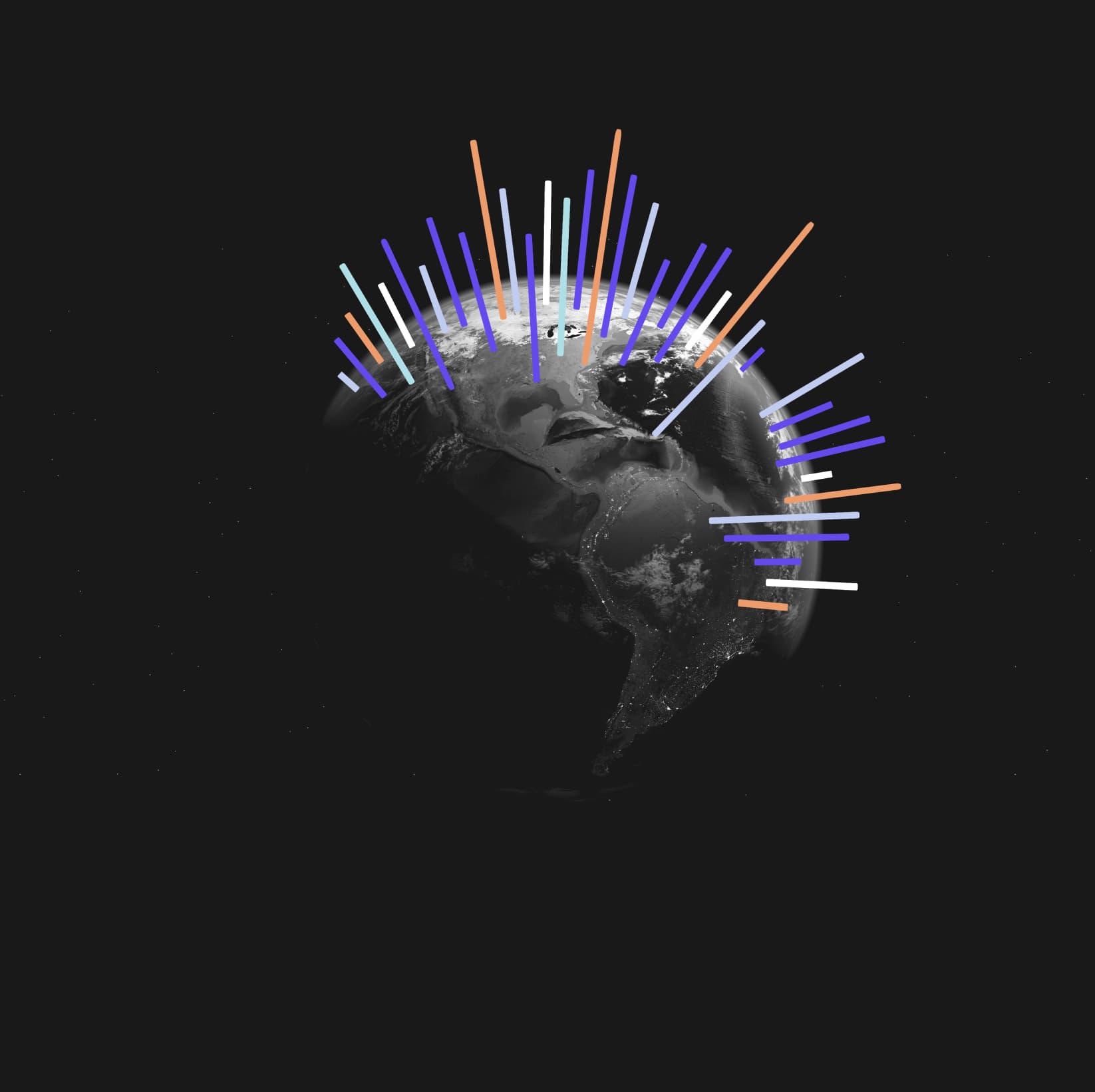
On the left side of the liveboard, you’ll find the total search volume for your product category for the last analyzed month. But the real magic lies in the bar graph on the right. Here, you can see the monthly search volume throughout your selected time period.
Hover over each bar, and watch as the total search volume for that specific month pops up. This number alone can provide a wealth of insights. Is the search volume rising or falling? How does it compare to previous months? Is there a sudden spike or drop? This feature allows you to track the ebb and flow of demand over time, helping you anticipate trends and stay ahead of the curve.
Want to go deeper? Check out the Yearly Search Volume graph. Here, you can see the search volume of three full consecutive years. This panoramic view of search volumes can help you identify long-term trends and patterns. It’s like having a time-lapse video of your market, allowing you to see how it evolves over time.
You can also make use of the Year-Over-Year comparison feature. This tool allows you to see the search volume for each month, year by year. You’ll discover which months are buzzing with high search volume and which ones are quieter. You can spot seasonal trends and understand when demand peaks and troughs. This knowledge can help you optimize your purchasing strategies, ensuring that you always meet customer demand, no matter the season.
But that’s not all. Trendata’s Market Size liveboard also offers a regional breakdown of search volumes. You can see this data represented in both a map and a bar graph. This feature allows you to understand regional demand patterns, helping you allocate your resources more effectively. Whether it’s deciding where to open a new store or where to focus your marketing efforts, this regional information can guide your decision-making process.
Market Development Insights
The Market Development liveboard is a tool that not only presents you with your market’s current standing but also unravels its growth trajectory.
Resembling the Market Size liveboard in structure, the Market Development liveboard offers a different perspective. It focuses on growth percentages, providing an in-depth understanding of how your product category is evolving over time.
On the left side of the liveboard, you’ll find the growth percentage of the last analyzed month compared to the previous month. This data point alone can offer valuable insights. Is the growth rate accelerating or decelerating? How does it compare to past growth rates? Understanding these nuances can help you align your strategies with the rhythm of the market.
But it doesn’t stop there. The trendline on the right side of the liveboard shows the growth percentage for each analyzed month compared to its predecessor. Hover over this line, and you’ll see the exact growth percentage for each month. This feature allows you to zoom into specific periods, helping you decode the story behind each spike and dip.
For those who prefer a broader view, the Yearly Search Volume Development graph at the bottom left corner comes in handy. This graph presents the growth percentage of an entire year compared to the year before. By juxtaposing this data with your sales figures, you can analyze the alignment between market development and your sales performance. Are they moving hand in hand? If not, perhaps it’s time to revisit your approach.
Now, let’s talk about regions. The Region tab provides a detailed breakdown of the product category development per region within your analyzed country. Presented in both a map and a bar graph, this feature calculates the growth percentage between the first and last month of the selected time period. With this, you can pinpoint the regions driving growth and those that need more attention.
Market Shares Insights
The world of business can often resemble a giant chessboard, with brands vying for dominance in their respective markets. In this complex game, knowledge is power. Understanding your position in the market and how you stack up against competitors can give you a significant edge. That’s where Trendata’s Market Shares liveboard comes into play.
At first glance, you might see a collection of graphs and numbers. But look closer, and you’ll find a treasure trove of insights waiting to be discovered.
Let’s start with the doughnut graph on the left. This graph represents all branded searches in your product category. Each brand is represented by a coloured block, and the size of the block corresponds to its market share.
Hover your mouse over these blocks, and you’ll see the Share of Search for each brand during the selected time period. This feature allows you to understand not just your own market share, but also that of your competitors. Are there any emerging players? Is anyone losing ground? These insights can help you assess your competitive landscape and adjust your strategies accordingly.
The graph on the right shows you how these branded searches have evolved over time. By hovering over the different lines, you can see the exact share of search for each brand at any given point in time. This data can help you track your progress, identify trends, and anticipate future shifts in the market.
For a deeper dive into regional dynamics, head over to the Region tab. Here, you’ll find an overview of the share of search per brand per region for the selected time period. This feature can help you understand regional variations in brand preferences, allowing you to tailor your strategies to different markets.
Finally, it’s time for some introspection. Do these numbers match your expectations? More importantly, does your own share of search align with your goals? If not, perhaps it’s time for a change.
Explore Market Dynamics with Trendata
We hope you’ve gained a deeper understanding of the power of our Market Overview insights. From market size to development and shares, each liveboard offers a unique perspective, empowering you to make strategic decisions backed by data.
Each graph and chart is more than just numbers and lines. They represent the heartbeat of your market, revealing trends, uncovering opportunities, and sometimes even sounding alarms. Hover over them, delve into the details, and let the data tell its story.
So, have you ever wondered how to navigate through the maze of market information and make sense of it all? With Trendata, the answer is right at your fingertips. Harness the power of our insights, steer your strategies with confidence, and watch as your business navigates its way to success.
We’re excited to see how you’ll use these insights to drive your business forward. In the world of business, knowledge is power. And with Trendata, you’re always in the know.