
Visualizing data effectively can be your key to unlocking insights that drive success.
We believe that visually compelling data speaks louder than spreadsheets. Forget about sifting through endless rows and columns and say hello to intuitive, dynamic and engaging visual representations of your data.
Switch seamlessly between tables and charts. Simply toggle between the table view or chart view with a click of a button. Just select ‘Change Visualization’ and you are presented with a comprehensive catalogue of chart types to choose from.
Let’s dive into different charts, where data tells a story and every story is a step towards informed decision-making.
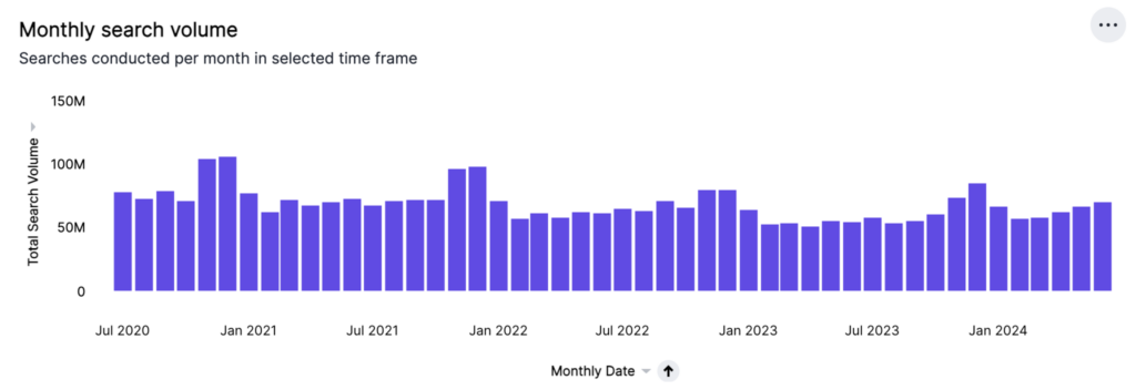
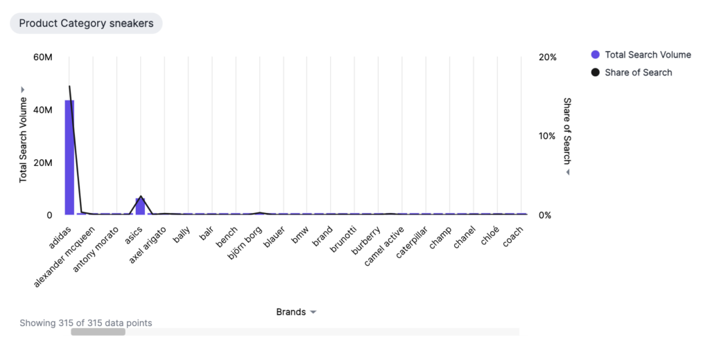
Column Charts
When it comes to visualizing data, the column chart is a reliable favourite for many reasons. At Trendata, we stand by this classic chart type as one of our most versatile options.
The vertical bar design of the column chart allows for easy comparisons between different data points, as the length of each bar corresponds to its respective value. It’s a simple yet effective way to convey important information, which is why we often default to this chart.
Keep in mind that for a column chart to be effective, there must be at least one attribute and one measure present in the data.
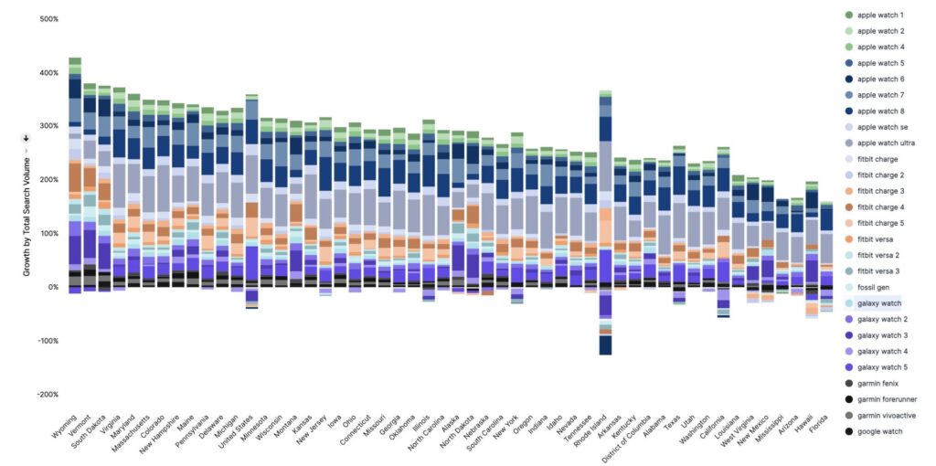
Stacked column charts
The stacked column chart may look similar to a standard column chart, but it has a key difference that sets it apart. Every column is divided into additional sections, each represented by a different colour in the legend, allowing for easy differentiation of data. Please note, that colour slicing is limited to attributes only.
This type of chart is particularly useful when you need to make comparisons between aggregated data and the individual pieces that make it up. Stacked column charts offer the option of displaying Detail Labels (summaries for each section) or Total Labels (sum of all segments) on configurable axis chips.
For a percentage view, you can plot the y-axis to add up to 100%. Just select the attribute chip used for colour slicing and under Format, toggle the Stack 100% option on or off. This feature is also available for stacked area and bar charts.
However, keep in mind that you need at least two attributes and one measure to represent the data in a stacked column chart.
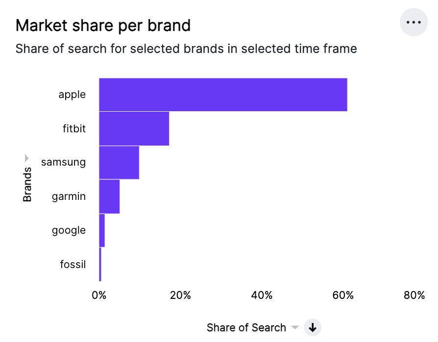
Bar Charts
Bar charts are a popular way to visually display data, and they are very similar to their vertical counterpart — the column chart. The key difference is in their orientation, as bar charts are designed to display data using horizontal rectangular bars.
This allows you to quickly compare data values against one another. The length of the bar is proportional to the data value, making it easy to see which attributes and measures are performing well, and which may need more attention.
When using a bar chart, it’s important to remember that you’ll need at least one attribute and one measure.
Stacked Bar Charts
The stacked bar chart is a helpful tool for comparing aggregated data. It’s similar to the standard bar chart but with the added benefit of a legend that divides each bar into sections of different colours. This colour-coding feature allows you to use only one attribute to slice the data, which makes it easier to visualise the different sections of the bars.
Additionally, you can view Detail Labels and Total Labels by clicking on a configurable axis chip, which provides summaries for each section of each bar.
For a different perspective, you can plot the x-axis as a percentage, with the whole bar representing 100%. To do this, select the attribute or measure chip used for colour slicing, then toggle the Stack 100% option under Format. This feature, also available for stacked area and column charts, allows you to switch between absolute and relative views.
Keep in mind that your search must meet certain requirements for it to be represented as a stacked bar chart, including having at least two attributes and one measure.
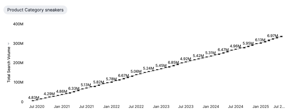
Line Charts
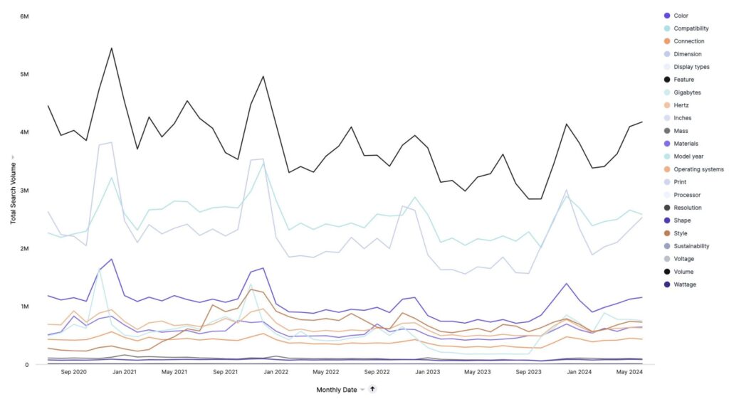
If you’re looking to represent trends over time, line charts are an excellent choice. They’re simple yet versatile, and Trendata often defaults to them as a visual representation.
The data is displayed as a series of points connected by straight lines, with the measurements ordered by the value on the x-axis.
To create a line chart, your search must have at least one attribute and one measure. If you have multiple attributes, you can use colour to slice and sort by the second attribute.
KPI Charts
Tracking the Key Performance Indicators (KPIs) of your data just got easier with the latest feature of creating visualizations. This chart empowers you to closely monitor crucial data changes and tailor it to perfectly align with your business objectives. Plus, you have the option to save your tailored KPI chart as an answer or incorporate it into a Liveboard for enhanced visibility.
By simply searching for a single measure or attribute like “Share of Search” or “Date”, Trendata generates a KPI chart showcasing the peak or the most recent value. For multi-term searches, you have full control over which column is visualised in the KPI chart.
You can further customise your KPI visualization by adding time comparison keywords like “weekly” or “monthly”, adjusting the amount of information displayed through the chart configuration menu, or applying conditional formatting. With this level of personalization, KPI Charts provide a valuable snapshot of your operation, tailored to your unique needs.
Configure Visualised Column
If your search includes multiple measures or attributes, the KPI chart will default to the first search term. To base your KPI chart on a different measure or attribute, follow these steps:
– Click on the chart configuration icon.
– Drag and drop the currently visualised column into the ‘Not visualised’ section.
– Select the new measure or attribute from the ‘Not visualised’ section and drag it into the ‘Visualised’ section.
Additionally, if you include a time column (columns of type Date, Datetime, Timestamp and Time) or keyword (Hourly, Daily, Weekly, etc.) in your search, it will appear in the Time axis section.
Time-Series Aggregation in KPI’s
By incorporating a keyword that compares across time periods in your search, such as ‘Share of Search weekly’, your KPI chart will display the most recent data point associated with your query. Importantly, it will also show the percentage increase or decrease from the preceding data point.
Consider this example: the total share of search for the week of 12/21/2023 was 120k, marking a 0.2% increase compared to the previous week’s total share of search. In this instance, ‘WoW’ denotes that the percentage change has been calculated on a week-over-week basis. You can also choose to evaluate changes daily (DoD), monthly (MoM), quarterly (QoQ), or annually (YoY).
If your goal is to create a KPI chart that showcases the difference between two specific date buckets, you simply need to define the time periods for comparison in the search bar. For instance, to compare the variance in the share of search between this quarter and the last one, search ‘share of search quarterly this quarter last quarter’.
It’s important to note that KPI charts can only be generated with data arranged in ascending or chronological order. Consequently, ‘date descending’ cannot be used as a filter for creating a KPI chart.
Sparkline Visualization for Time-Series KPI’s
Sparkline visualization is a powerful tool that can significantly enhance your time-series KPI analysis. For instance, when you query a measure with a time-series keyword such as ‘share of search weekly’, your KPI chart automatically transforms into a sparkline visualization. This representation displays all data points defined in your query, providing a succinct yet comprehensive overview of your data’s trajectory.
What makes this visualization particularly useful is its emphasis on the two most recent data points, which are prominently highlighted for easy comparison. This feature allows you to quickly grasp the latest trends and changes in your data.
Furthermore, the sparkline visualization adapts to ongoing time periods. If the date bucket defined by your query is still in progress (for example, if you’re viewing a ‘share of search weekly’ KPI on a Wednesday), the visualization will display a dotted line.
This line connects the last data point to the accumulated value up to the most recent date, providing a real-time snapshot of your KPI’s performance.
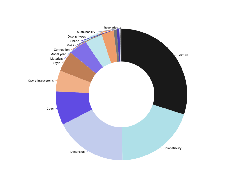
Pie Charts
Pie charts, also known as circle charts, are a tried and true method of displaying data. By dividing data into slices, pie charts make it easy to see the numerical proportion of different categories.
The arc length of each slice corresponds to the quantity it represents. In Trendata, the default pie chart takes on the form of a doughnut, with a defined ring separating each slice.
How Pie Charts Divide Data
Pie charts divide your data into sectors that each represent a proportion of a whole circle, you can quickly see how each segment compares to the whole.
To fully understand the values of each slice and the percentage values, simply select the Chart configuration icon and then Settings > All labels. It’s important to note that to create a pie chart, your search must have at least one attribute and one measure. Additionally, there can be no more than 250 values in the attribute column.
Pie in Pie Charts
Pie charts are a popular way of visually representing data, and the pie in pie chart takes it up a notch, allowing for comparisons of multiple attributes within a single chart.
By creating two concentric pie charts, it becomes possible to compare two different measures of a particular attribute. To create a pie in pie chart, simply assign two measures to the Size section under Edit chart configuration.
Colour Customisation of Pie in Pie Charts
Customising the colours of your pie chart is a simple yet effective way to enhance data visualization. Using the Chart Configuration Icon, you can easily make these changes. If you have a pie in pie chart, your colour changes apply to both widgets that apply to the same attribute value. Here’s how to do it:
– Click on the Chart Configuration Icon.
– In the ‘Edit Chart’ window that appears, choose the attribute under the ‘Category’ section.
– Next to each item you wish to recolour, select the colour chip. Alternatively, you can enter the Hex value for precise colour matching.
To gain more detailed insights from your sparkline visualization, simply hover over it. This will reveal the exact value of the metric and the corresponding date for each data point.
Custom Comparison Points
You can tailor your KPI chart to display a percent change comparison between the most recent data point and a custom comparison point of your choosing. This feature allows for more nuanced analysis and greater flexibility in interpreting your data trends.
The custom comparison points are contingent on the time-based keywords used in your search, such as ‘monthly’ or ‘weekly’. When using one of the following time buckets, you can select from a range of comparison options:
– Hourly: Compare with the previous available data point or the previous hour.
– Daily: Options include the previous available data point, previous day, same day of the previous week/month/quarter/year.
– Weekly: Compare with the previous available data point, previous week, same week of the previous month/quarter/year.
– Monthly: Options include the previous available data point, previous month, same month of the previous quarter/year.
– Quarterly: Compare with the previous available data point, previous quarter, or same quarter of the previous year.
– Yearly: Options include the previous available data point or the previous year.
By default, the comparison point is set to ‘previous available data point’, which compares your most recent data point to the last recorded data point. In instances where data is missing between the most recent data point and your chosen comparison point, it’s recommended to use the ‘previous available data point’. This will display the percent change from the last recorded data point, ensuring a comprehensive view of your data trends.
Configure KPI Display Options
When crafting a KPI chart with a time period keyword, you have the flexibility to alter the display options to best suit your needs. This can be done before you save your creation as an answer or pin it to a Liveboard.
To make these adjustments, simply click on the chart configuration icon and select ‘Settings’. Here are the display modifications you can make:
– Date Label Visibility: Choose whether to display or hide the date label using the ‘Show Date Label’ option.
– Sparkline Visualisation: Use the ‘Show Sparkline’ option to either showcase or conceal the time-series visualisation.
– Comparison Display: The ‘Show Comparison’ option allows you to either display or hide the percentage change since the selected last period.
– Positive Change Colour: Customise the colour of the percentage increase label with the ‘Positive change colour’ option.
– Negative Change Colour: Alter the colour of the percentage decrease label using the ‘Negative change colour’ option.
Apply Conditional Formatting
Conditional formatting serves as a powerful tool that can be employed to provide visual cues for KPIs or threshold metrics. By using this feature, you can easily identify areas where performance is either falling short of or exceeding set targets. It adds colour and font formatting to your search result based on the thresholds you define.
It’s important to note that conditional formatting only influences the text of a KPI visualization and does not affect sparkline visualizations. To incorporate conditional formatting into your KPI, follow these steps:
– Click on the chart configuration icon located to the right of your KPI.
– Under the ‘Visualised’ section, select the measure tile, for instance, “Total Search Volume”.
– From the ‘Conditional Formatting’ dropdown menu, choose ‘+Add Rule’.
– Define the range values and set the formatting options. For example, in the scenario below, the KPI text becomes bold and turns red when its value satisfies the condition “between 10,000 and 20,000”.
By clicking on the information icon that appears to the right of the measure, you can view the conditional formatting rule(s) applied to a KPI.
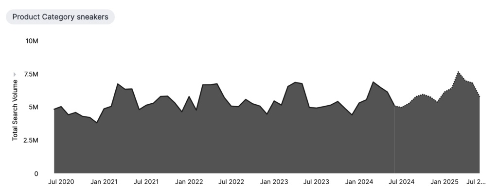
Area Charts
Area charts provide a visual representation of quantitative data, allowing you to easily compare different portions of the chart. They are based on the line chart format, but instead of just displaying lines, the areas between the x-axis and the line are filled in with colour.
To create an area chart, you will need at least one attribute and one measure. This type of chart is particularly useful when demonstrating changes over time or identifying trends in data.
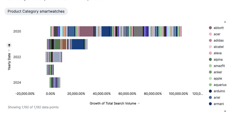
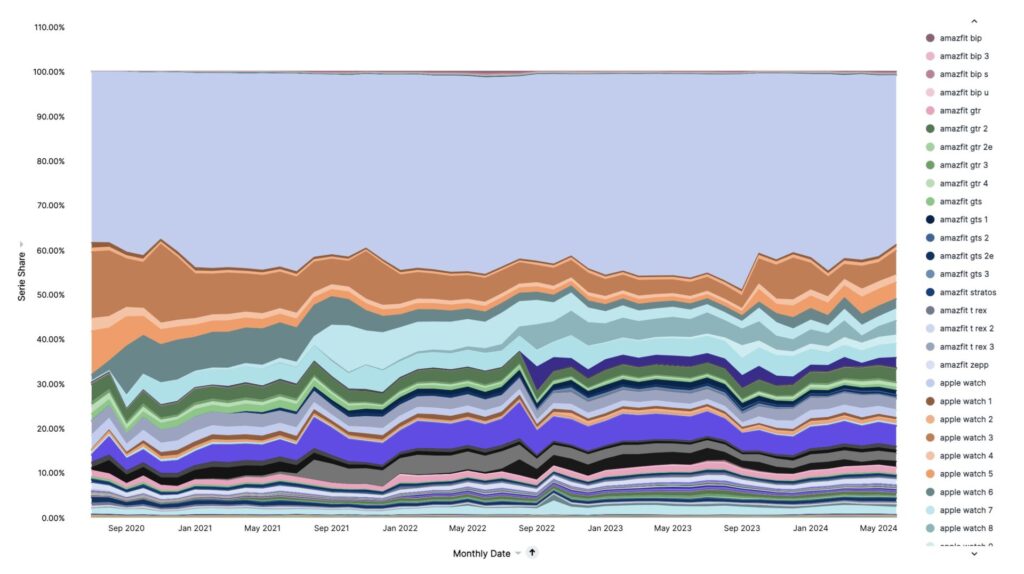
Stacked Area Charts
A stacked area chart is a variant of the area chart that features an attribute in the legend, effectively dividing the area into distinct layers. It’s important to remember that only an attribute can be utilised to create color-sliced layers.
This type of chart is particularly useful in demonstrating the relative contribution of different components to the cumulative total of a measure over time.
By default, stacked area charts plot the y-axis as a percentage. However, for a more comprehensive view, you can adjust your chart to set the y-axis to 100%. To do this, click on the ‘Chart configuration’ icon and select the y-axis measure. Under ‘Number format’, simply toggle ‘Stack 100%’ on or off. The ‘Stack 100%’ option can also be found under the attribute used for colour slicing.
For representation as a stacked area chart, your search should consist of at least two attributes and one measure.
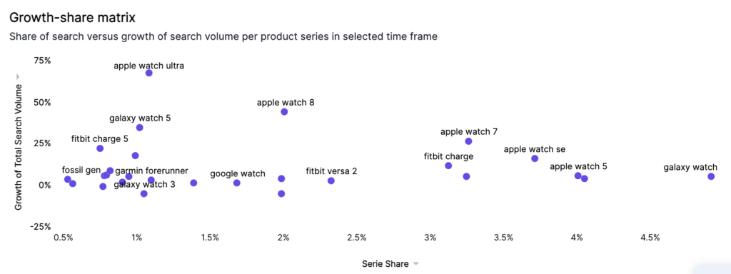
Scatter Charts
A scatter chart serves as an excellent tool for identifying correlations or anomalies in your data. This type of chart presents your data as a collection of individual points, which can be distributed either evenly or unevenly.
By displaying your data as a collection of points on a graph, you can easily spot any correlations or outliers in your dataset. Each point is plotted based on its own axes values, allowing you to find relationships between different columns.
One notable characteristic of scatter charts is their ability to both slice and color-slice data. This slicing feature is exclusive to scatter and bubble charts. It empowers you to segment data based on a specific column in your dataset; for instance, ‘brand’. By hovering over a data point, you can identify the department it corresponds to.
To represent your data as a scatter chart, your search should include at least one attribute and one measure.
Bubble Charts
A bubble chart serves as a specialised version of the scatter chart, with data points represented as bubbles. To create a bubble chart, your search should contain at least one attribute and two measures.
Bubble charts are capable of displaying three to five dimensions or measures of data. Beyond the standard x- and y-axis, the size of each bubble signifies a particular measure. Moreover, bubble charts can incorporate two additional attributes when you employ slicing and/or color-slicing.
Bubble Size
The dimension of each bubble is determined by the measure you select under ‘Edit Chart’.
Slice and Slice by Color
Bubble charts offer the functionality to both slice and color-slice data, a feature shared with scatter charts. Slicing allows you to segment data based on a specific column. For instance, in the illustration below, we’ve sliced the chart by ‘product series’ and used ‘region’ for color-slicing. By hovering over a data point, you can identify its corresponding product series type and region. In this case, we have a (insert image):
Bubble charts offer a unique way to visualise and analyze multidimensional data, helping to reveal patterns and correlations that might otherwise remain hidden.
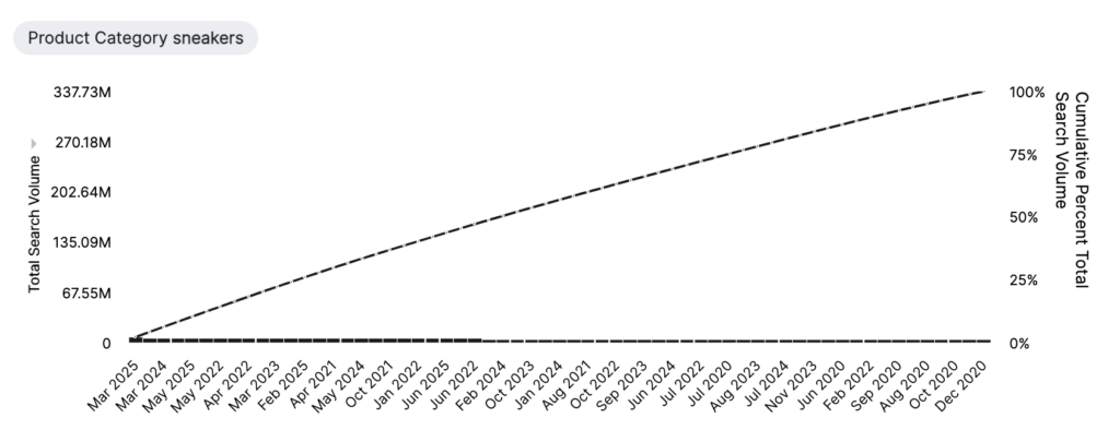
Pareto Charts
A Pareto chart is a unique combination of columns and a specific line chart that serves as a powerful tool for data analysis.
In a Pareto chart, individual values are displayed in descending order through columns, while the cumulative percentage total is represented by the line chart. The left y-axis corresponds to the columns, illustrating individual values, while the right y-axis aligns with the line chart, indicating the cumulative percent total. By the time the line reaches its end, the cumulative percentage total amounts to 100%.
To generate a Pareto chart, your search must include at least one attribute and one measure.
Waterfall Charts
The waterfall chart displays how an initial value evolves due to a sequence of intermediate positive or negative impacts.
These charts excel in showcasing both growth and decline, making them particularly suitable for illustrating ‘growth over time’ scenarios. The columns are colour-coded to differentiate between positive and negative values.
To create a waterfall chart, your search should encompass at least one attribute and one measure. This type of chart provides a clear and intuitive way to understand the cumulative effect of sequential data points on an initial value, making it easier to track progress, analyze results, or explain changes over time.
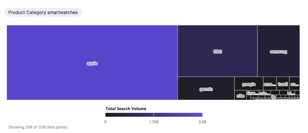
Treemap Charts
The treemap chart is a versatile tool that represents hierarchical data through an arrangement of nested rectangles.
In a treemap chart, both the colour and size of the rectangles signify two different measure values. Each rectangle, also known as a branch, represents a specific attribute value. Some branches may further encompass smaller rectangles, or sub-branches, allowing for an efficient display of a large volume of items.
To configure a treemap chart, you can adjust the columns of your search into category, colour, and size under ‘Edit Chart Configuration’. At least one attribute and two measures are required in your search for it to be represented as a treemap chart.
Customising Treemap Color
By default, treemap charts use varying shades of blue. However, you can personalise the treemap colour under ‘Chart Configuration’. To modify the basic colour used by the treemap, follow these steps:
– Navigate to any treemap chart for which you have editing privileges.
– Click on the ‘Edit Chart’ icon located on the left side of your screen.
– Select the chip for the measure under ‘Slice with colour’.
– Click the ‘Colour’ dropdown, and choose from the available options in the colour palette.
Treemap charts offer an effective way to visualise hierarchical data, enabling complex data sets to be understood at a glance.
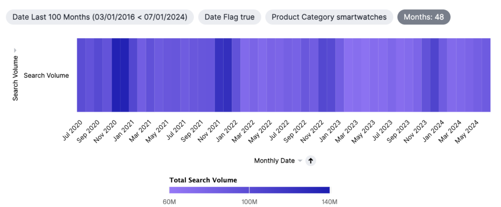
Heatmap Charts
Heatmap charts bear a resemblance to treemap charts in their use of colour coding to illustrate data values. However, unlike treemaps, heatmaps do not utilise size as a data measure. Instead, they require an extra attribute.
The value assigned to each cell is determined by the measure chosen under ‘Edit Chart Configuration’.
Personalising Heatmap Colour
By default, heatmap charts feature various shades of teal. Nonetheless, you can customise the heatmap colour under ‘Chart Configuration’. To alter the basic colour used by the heatmap, follow these steps:
– Locate any heatmap chart that you have editing rights for.
– Click the ‘Edit Chart’ icon on the left side of your screen.
– Choose the chip for the measure under ‘Value’.
– Click the ‘Colour’ dropdown, and select your desired option from the colour palette.
Adjusting Data Labels
Heatmaps, by default, enable data labels for every value. If you wish to disable data labels for heatmaps, take these steps:
– Go to the heatmap where you want to disable data labels.
– Click the ‘Edit Chart Configuration’ icon located in the upper right of your screen.
– The ‘Edit Chart’ panel will appear. Select the ‘Settings’ tab.
– Choose the ‘All labels’ option. This will enable or disable data labels as per your preference.
Heatmap charts provide a visually impactful way to represent complex data sets, making it easier to quickly discern patterns and correlations.
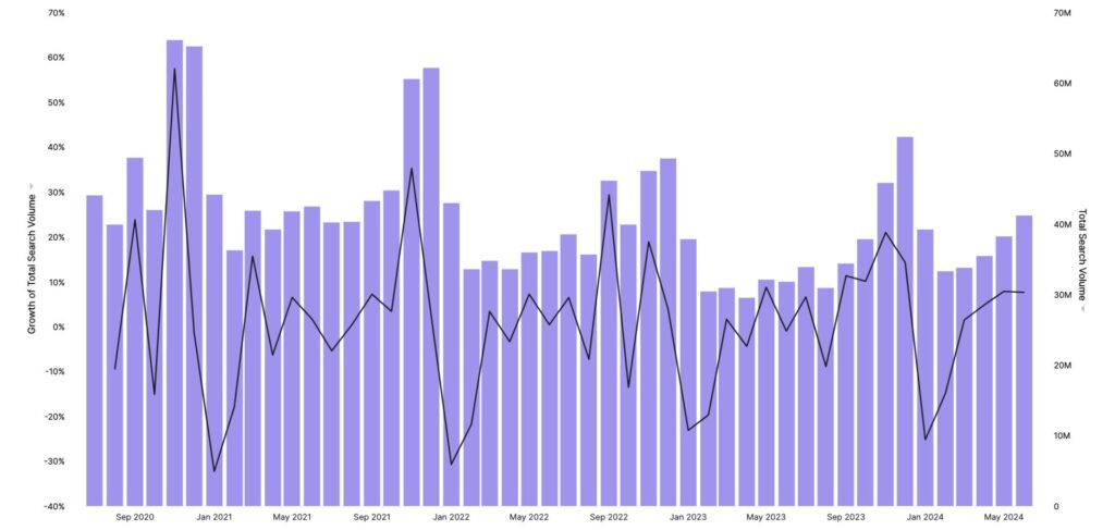
Line Column Charts
A line column chart merges the functionalities of column and line charts. This type of chart allows you to represent at least one attribute and two measures, providing a comprehensive view of your data.
Line column charts present one measure in the form of a column chart, while the other measure is depicted as a line chart. Each measure has its distinct y-axis, ensuring clarity and precision in data interpretation.
For an even more integrated view, you can opt for a shared y-axis. This can be achieved by selecting the ‘Group’ option for both measures, accessible via the dropdown menu icon next to the y-axis label.
This fusion of line and column charts provides a visually rich and informative means to analyze and compare diverse data, offering valuable insights into trends, correlations, and patterns
Line Stacked Column Charts
A line stacked column chart blends the features of the stacked column and line charts. This type of chart bears similarity to a line column chart, but with an added dimension – it divides its columns based on an attribute in the legend.
In a line stacked column chart, two distinct y-axes represent each measure, providing a detailed and comprehensive view of your data.
For a more unified representation, you can opt for a shared y-axis. This can be achieved by clicking the dropdown menu icon next to the y-axis label and choosing ‘Group’ for both measures.
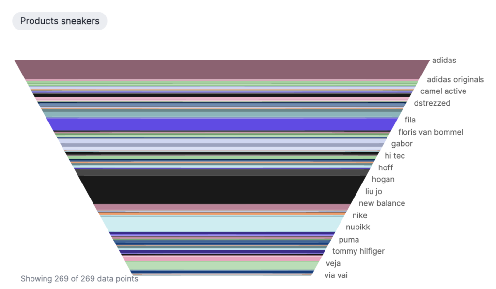
Funnel Charts
Funnel charts illustrate processes that consist of progressively diminishing proportions, culminating in a total of 100 percent. These charts bear resemblance to stacked percent column charts and are frequently used to depict various stages in a sales process.
Funnel charts enable you to visualise the evolution of data as it transitions from one phase to the next. Each phase is represented as distinct proportions within the chart, providing a clear and comprehensive view of your data.
To represent your data as a funnel chart, you require at least one attribute and one measure. Note that the attribute should not contain more than 50 values for optimal visualization.
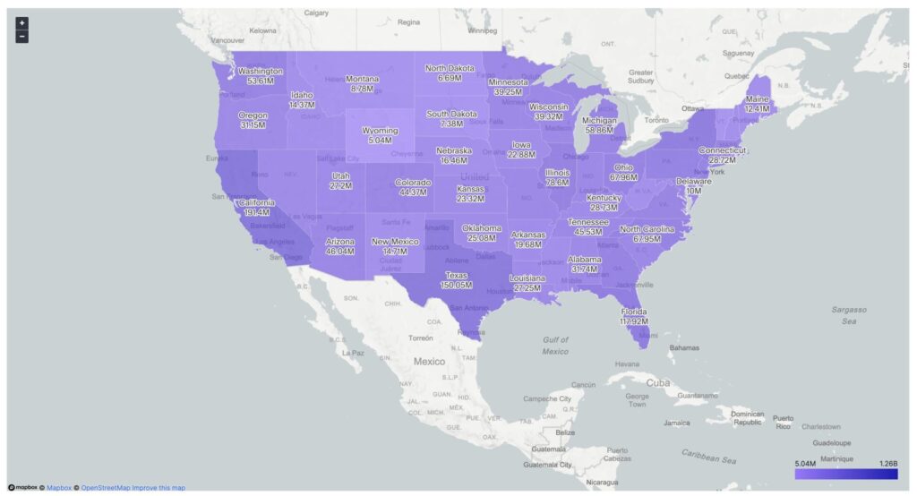
Geo Charts
Geo charts empower you to visualise data based on location, making them an excellent tool for geographical analysis. Trendata offers three types of geo charts: Geo Area, Geo Bubble, and Geo Heatmap charts.
Geo Area Charts
Geo Area charts emphasise specific regions, delineating boundaries for various geographical areas. To create a Geo Area chart, your data set must include a geographical column with the appropriate level of detail.
Geo Bubble Charts
Geo Bubble charts, akin to regular bubble charts, represent the value of a measure through the relative size of bubbles. Such charts are particularly effective when working with zip code data. To create a Geo Bubble chart, your data set should include either a geographical column or a pair of latitude and longitude coordinates.
Geo Heatmap Charts
Geo Heatmap charts illustrate the value of a measure through varying colour intensities across different areas. They are ideal for visualising relative values or densities of a measure by location, such as search volumes relative to customer zip codes. To utilise a Geo Heatmap chart, your data set must include either a geographical column or a pair of longitude and latitude coordinates.
In each case, you can customise your geo chart by changing the Map Type as described above. This flexibility allows you to tailor your charts to your specific needs and preferences, enhancing data interpretation and decision-making.
Customizing Geo Charts
You can customise your geo charts by altering the Map Type. Here’s how:
– Navigate to any geo chart you have editing privileges for.
– Click on the edit chart icon located on the left side of your screen.
– Select ‘Settings’ in the Edit Chart panel.
Open the Map Type dropdown and choose from the following options: Light (default), Dark, Outdoors, Streets, Satellite, or Satellite Streets.
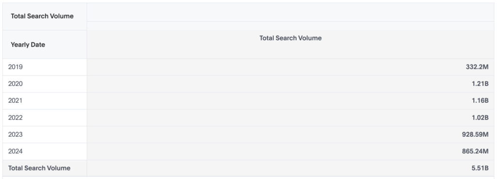
Pivot table
Pivot tables are powerful data visualization tools that allow you to reorganise and summarise selected columns and rows of data in a spreadsheet or database table to obtain a desired report. They provide a unique way of arranging your data, enabling you to view some data horizontally and some vertically within the same table.
A pivot table is essentially a dynamic chart time table that features an intuitive drag-and-drop interface for easy customisation. This flexibility allows for in-depth data exploration and analysis, making pivot tables an excellent choice for large datasets.
To visualize your data as a pivot table, follow these steps:
– Click on the ‘Change Visualisation’ icon located near the upper right of your screen.
– Select ‘Pivot Table’ from the dropdown menu.
Please note, that to effectively use a pivot table, your search should contain at least one attribute and one measure.
For further customisation and interaction with your pivot table:
– Right-click a row or column heading to display a contextual menu.
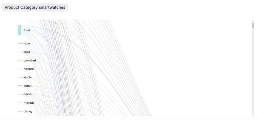
Sankey Charts
Sankey charts are a unique type of flow diagram that visually depict the magnitude of flow through a system or process. They are particularly effective for presenting transactional data, such as financial transactions tracking money movement across accounts or product processing stages.
A common use case for Sankey charts is in marketing analytics, where they are often used to analyse sales conversions by illustrating the customer journey across different stages.
Creating a Sankey chart involves the following:
– You need at least two attributes and one measure.
– The x-axis attributes should contain a maximum of 13 values.
– In Trendata, Sankey charts are read from left to right.
– The key components of a Sankey chart are:
Flows: Represented by lines whose width corresponds to the measure value. The wider the line, the larger the flow quantity.
Nodes: Depicted as solid bars, these represent the attributes or “steps” in the process.
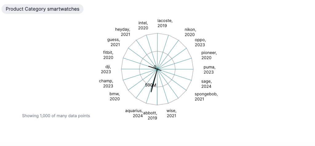
Radar (Spiderweb) Charts
Radar (or spiderweb( charts are compelling visualisation tools that present multi-dimensional data on a two-dimensional platform. Each axis or ‘spoke’ radiating from the centre represents a different variable, allowing for the comparison of three or more qualities at once.
When creating a radar or spiderweb chart, consider the following:
– You need to provide at least one attribute and one measure.
– The values are plotted from smallest to largest, extending towards the outer edge of the web.
– Each spoke of the web is dedicated to one of the variables.
The points representing each value on the web are connected to form a shape, providing a visual snapshot of the data pattern.
Radar charts are particularly effective for visualizing user rankings of a product or experience, examining relative values for a single data point, and identifying outliers in your data, thereby providing invaluable insights for informed decision-making.
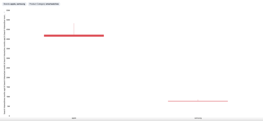
Candlestick Charts
A candlestick chart visually narrates the price movements of various financial instruments, including stocks, derivatives, currencies, and commodities.
Known for their ability to facilitate swift decision-making, candlestick charts are widely used in areas such as stock, foreign exchange, commodity, and options trading. This is largely due to their ability to encapsulate four critical price measurements over time, namely: the opening price, highest price, lowest price, and closing price (OHLC).
Each ‘candlestick’ on the chart represents data for one specific trading day. Consequently, a monthly chart would typically display around 20 candlesticks, each corresponding to a different trading day. The date is plotted along the horizontal (X) axis, factoring in non-trading days.
While a day is the standard interval, candlestick charts can be tailored to represent intervals shorter or longer than a day, as long as each interval distinctly presents the four crucial measurements.
In essence, candlestick charts provide a comprehensive, at-a-glance understanding of market trends, making them an invaluable resource for strategic financial decision-making.
Visualise, Analyse, and Present with Trendata
Effective data visualisation through the use of charts can make complex data digestible,help spot trends and outliers, and support smarter decision-making. And Trendata’s diverse range of presentation options further amplifies the power of these charts.
Offering a user-friendly interface and customizable features, Trendata allows you to tailor your charts to best suit your data needs. This flexibility, combined with Trendata’s real-time data updating capability, ensures that you always have the most accurate and relevant information at your fingertips.
Whether you’re analyzing product usage, comparing relative values, tracking brand sentiments, or spotting market trends, Trendata provides a dynamic, efficient, and effective solution for all your data visualisation needs. Harness the power of Trendata today, and transform the way you view and interpret data.